Running an online store, you keep asking: when do I push ads, what time do I send the email, which day should the flash sale run? Most people lean toward the hours with the most traffic, but the hours that draw the most traffic and the hours that actually sell aren't always the same. This article walks through why the "traffic peak" and the "revenue peak" drift apart, how to find the days and hours your sales peak, and how to shift your ad and email timing toward those peaks, in plain words.
Table of contents
TL;DR#
- The hours that draw the most traffic and the hours that actually sell aren't always the same. What to watch isn't headcount, it's the peak in revenue per session (RPS).
- That your sales peak by day and hour is backed by research too. But it's a tendency, not a fixed law, and the real peaks differ by store.
- Read the revenue peaks as two separate axes — day and hour — and overlay them in your head. You don't build a fine day-by-hour grid (a cross-tab).
- Once you see the days and hours that sell, you can shift ad bidding, email sends, and flash-sale timing toward those peaks.
1. Busy hours and buying hours are not the same#
Bottom line: the hours that draw the most traffic and the hours that actually sell aren't always the same.
Many stores look at analytics and lean their ads and emails toward "the hour with the most visitors." But the hour that draws the most people isn't always the hour that sells the most. On weekends, for instance, browsers swell and traffic rises, yet the share of people who actually buy often drops. Meanwhile, some weekday hour pulls fewer visitors, but the ones who come buy well. In short, "headcount" and "how well it sells" move differently.
Here we use revenue per session (RPS). RPS is revenue divided by sessions (the number of visits), showing "how much revenue one visit produced on average." Read the hours by RPS instead of by headcount, and you see not "when are people here" but "when does it sell efficiently." The basics of RPS are covered in Revenue Per Session: Compare EC Ad Channels by Revenue.
There are several ways to split visitors, too. This article splits by "when" (day and hour). Separately, splitting by "who" (new vs returning) is covered in Splitting Revenue by New vs Returning: The Measurement Traps, and splitting by "which device" (smartphone vs PC) in Smartphone vs. PC Revenue: Reading Sales by Device. All are part of the same family — splitting visits and reading the revenue — just along different axes.
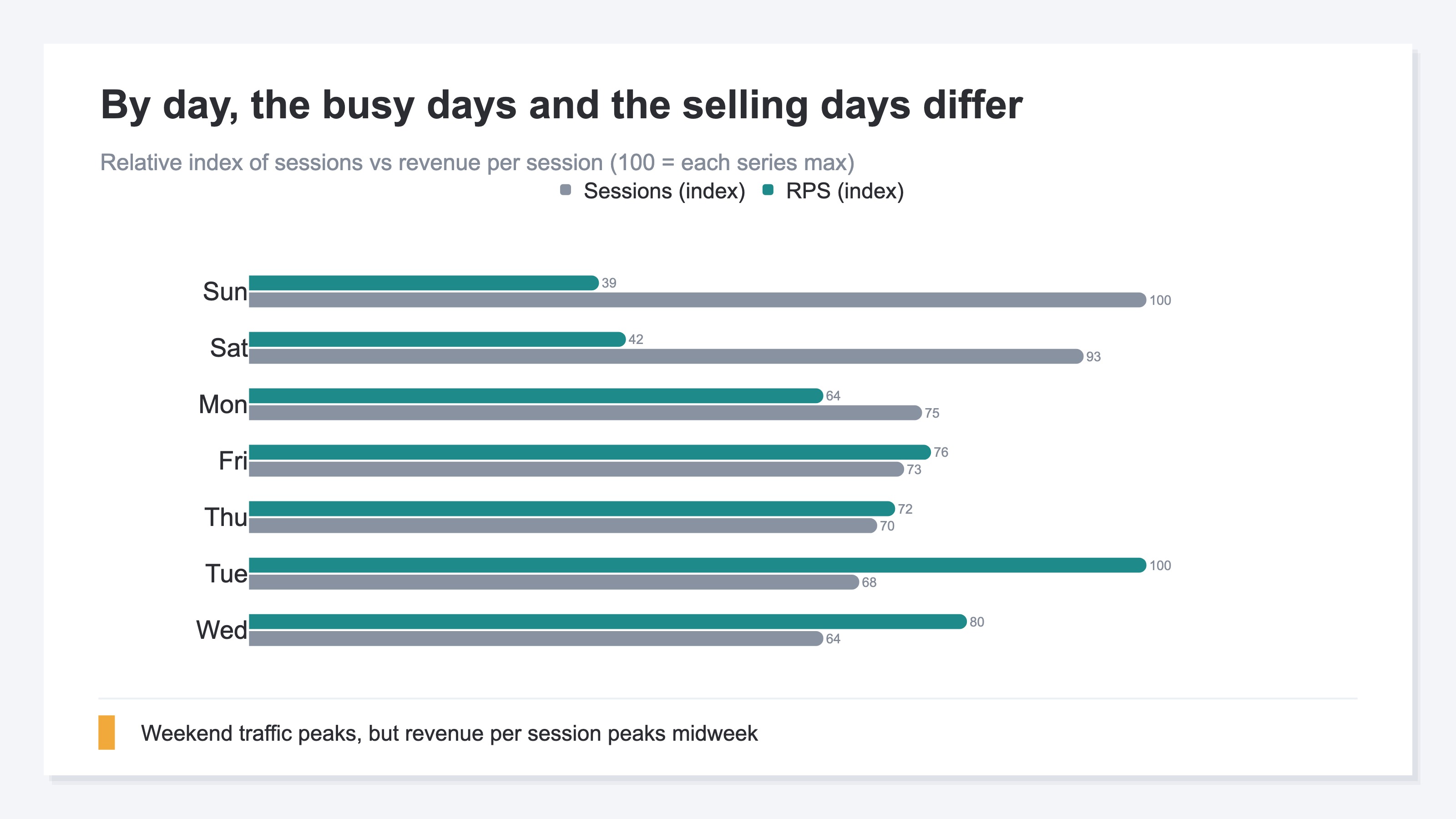
The chart below compares, by day, "how busy it is" against "RPS (revenue efficiency)." Traffic peaks on weekends, but the RPS peak shows up midweek. The two peaks drift apart.
2. Research backs when your sales actually peak#
Bottom line: that your sales peak by day and hour is backed by research too.
Here's the study behind this. Titled "Portrait of an Online Shopper: Understanding and Predicting Consumer Behavior," it used a large body of online purchase logs to study the patterns of when and what people buy [1].
In this study, Monday purchases are reported to be about 32.6% higher than Sunday [1]. It also shows a regular within-day rhythm, where buying tends to peak from late morning into the early afternoon on weekdays [1]. And it reports that the pricier the item, the longer the gap from the previous purchase tends to be — people buy the next one after their wallet recovers [1].
The chart below illustrates this "weekly purchase peak." Weekdays run higher and weekends lower, with Monday the highest.
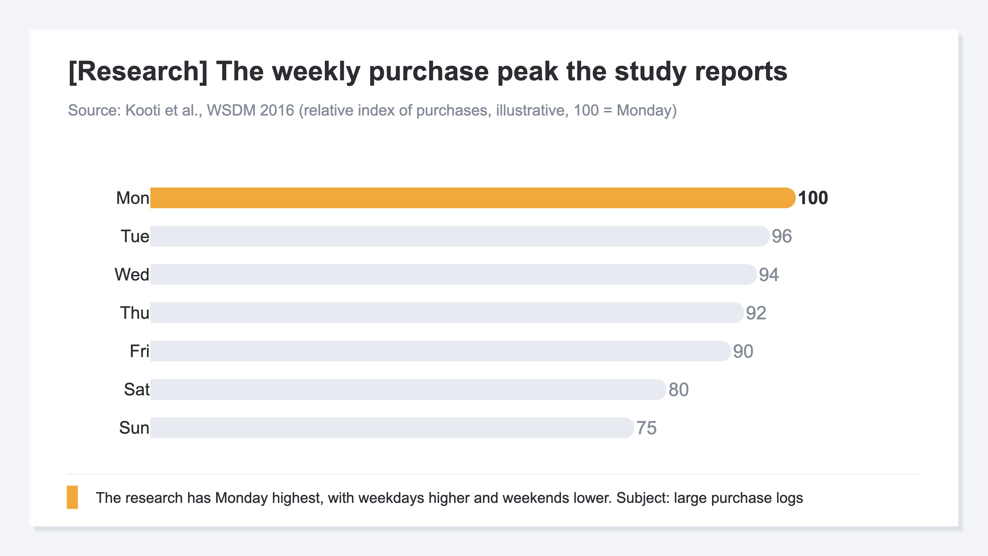
One thing to make clear. The subject of this study is a specific large body of purchase logs, so the numbers themselves are about that subject. The skeleton — that purchases peak by day and hour — likely applies to many e-commerce sites, though how strongly it applies varies by store and product. So don't take this as "a fixed law that holds for any site"; confirming the real peaks with your own site's data is what's accurate. The research is a map of "this kind of tendency exists"; the real peaks are measured on your own site.
3. Read day and hour as two separate axes and overlay them#
Bottom line: the realistic approach is to read the revenue peaks as two separate axes — day and hour — and overlay them in your head.
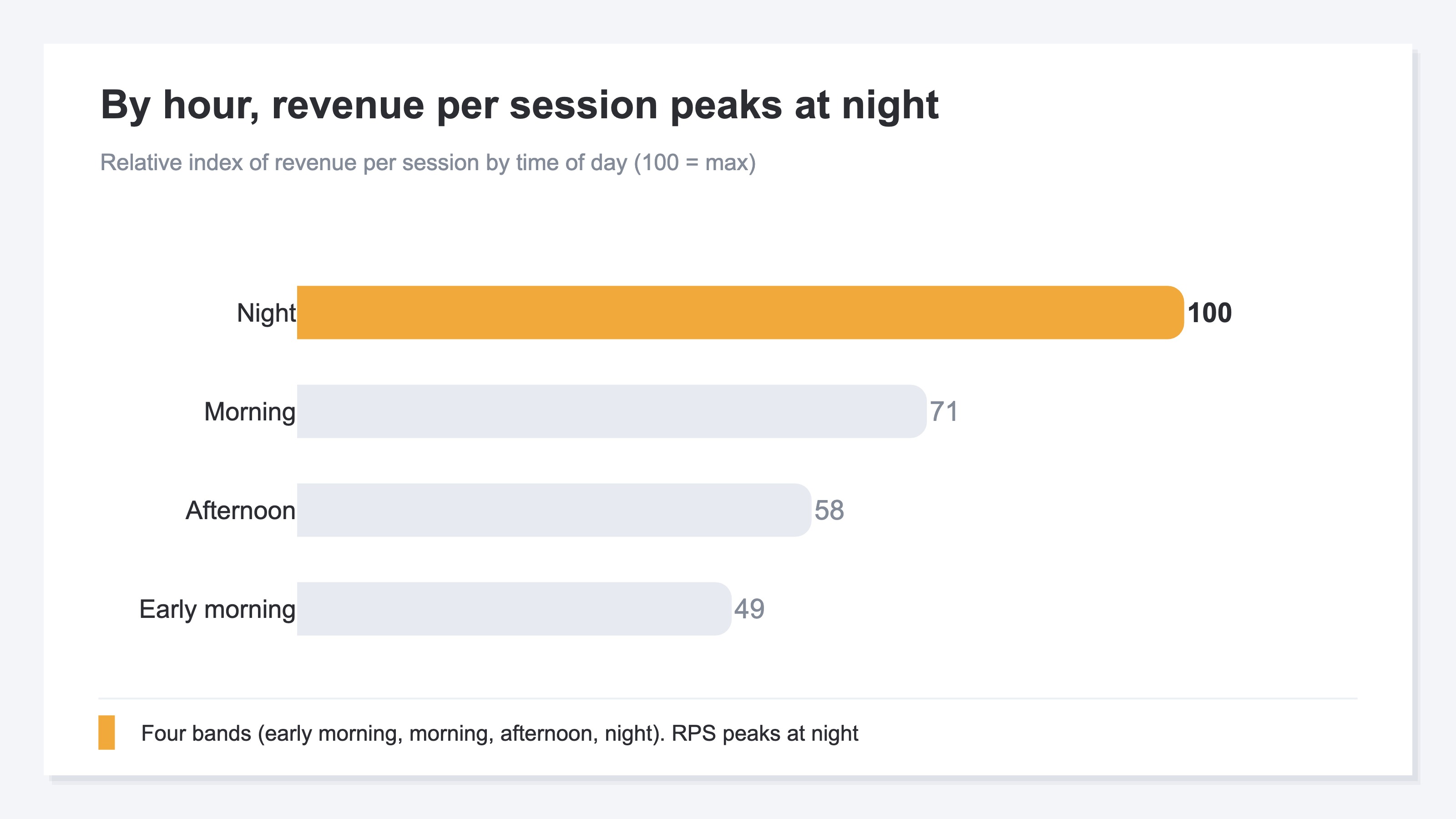
After the day chart, let's look by hour. The chart below shows revenue per session (RPS) by time of day. Time of day is read in four bands — early morning, morning, afternoon, and night — not in fine hour-by-hour slices. In this example, the RPS peak shows up at night.
The key here is that we're reading the day peaks (the earlier chart) and the hour peaks as "two separate axes." We are not building a single grid that crosses day and hour — like "how much did Tuesday night sell." We also set aside the change versus the prior period (period-over-period) in this view. What you do is simple: read the day peaks on the day axis, the hour peaks on the hour axis, and overlay them in your head — "Tuesday is strong, night is strong, so lean toward Tuesday night." That's enough to decide, and it actually reduces blind spots compared with building a fine crossed grid. The finer you slice the cells, the smaller each number gets and the more it swings on random noise.
4. See the peaks and you can time ads and email#
Bottom line: once you see the days and hours that sell, you can shift ad, email, and flash-sale timing toward those peaks.
The idea of the move itself is very simple: lean toward the hours that sell. Concretely, match the hours you raise ad bids to the revenue peaks, shift email send times to hours that are "likely to be opened and likely to buy," and run flash sales on the days and hours that sell. How a one-SKU store allocates its ad budget is covered in Single-Product Ad Budget: How a One-SKU Store Allocates by Channel Profit.
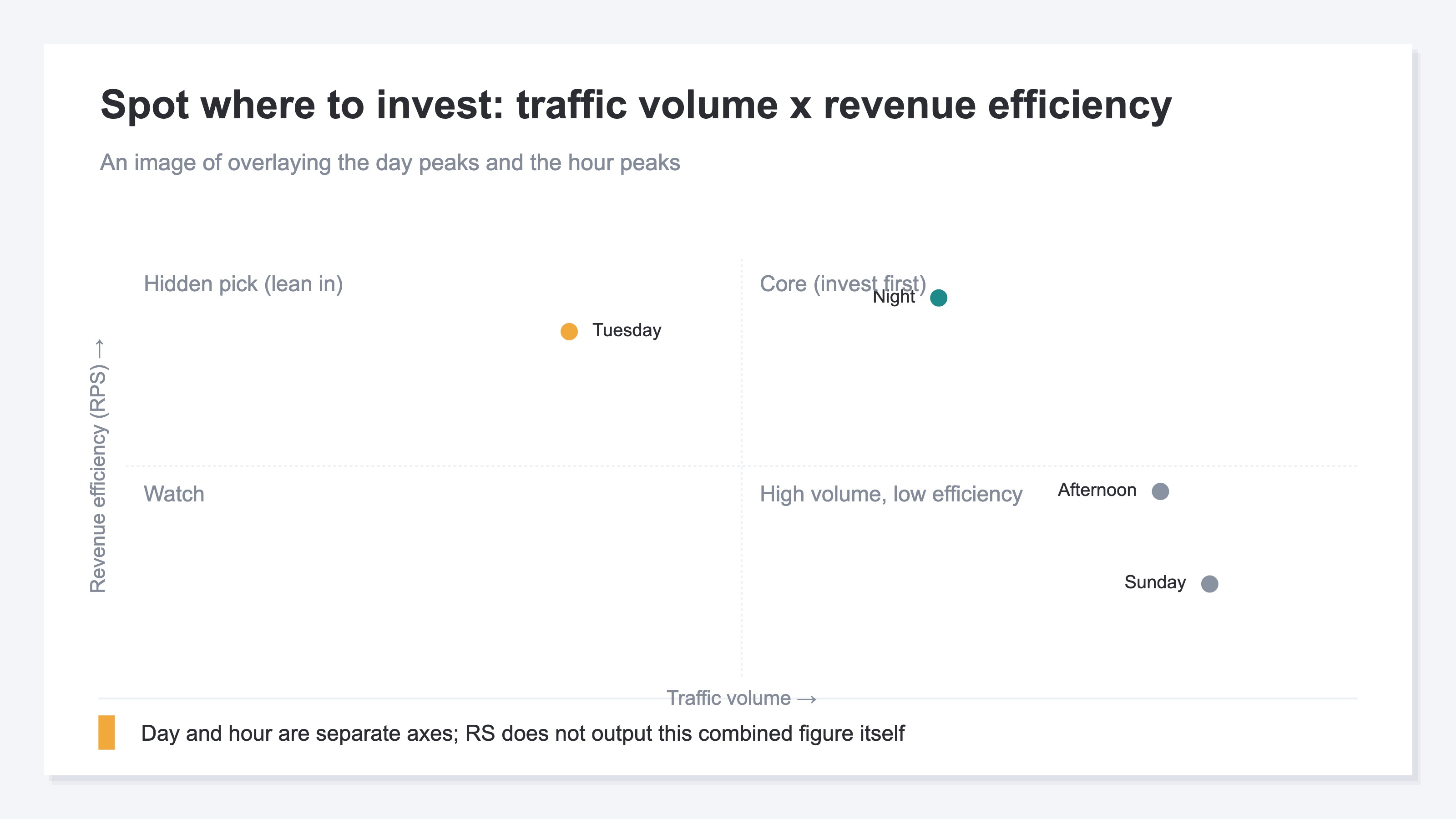
The chart below is an image of overlaying the day peaks and the hour peaks on one plane to spot where to lean. The horizontal axis is traffic volume, the vertical axis is revenue efficiency (RPS). Top-right (lots of people and high efficiency) is the top priority. Top-left (fewer people but high efficiency) is a hidden pick. Bottom-right (lots of people but low efficiency) is a place not to over-expect from, even if the numbers look big.
What's hard isn't the move itself, but pulling out "the hours that sell" accurately, every time. Analytics (GA4) can show the tendency of how many people come by hour, and that's useful as a starting point. But what you see there is the peak in session or user counts, not the peak in revenue per session (RPS). You can build a time-of-day-by-revenue view yourself in GA4's exploration, but redoing it page by page and month by month is heavy and the setup breaks easily. Even when the idea is simple, pulling out the accurate peaks again and again is where most of the labor lives.
RevenueScope helps
By now it's clear you should allocate by "when does it sell," not "when is it busy." What's left is how to pull out those "days and hours that sell" accurately. Trying to do it yourself, you hit two walls. One: what GA4 shows by hour is the peak in session or user counts, not the peak in revenue per session (RPS). Two: as What GA4's AI Assistant channel does and doesn't show notes, tying revenue to time of day and tracking it page by page, month by month, is structurally heavy and fragile by hand.
RevenueScope takes over that split. By day and by hour, it lets you compare sessions, revenue per session (RPS, revenue divided by sessions), and revenue, each in one view (figures shown are demo data). You can check not just "when is it busy" but "when is it selling," lined up on the same screen.
First, asked by day, it returns this.
| Day | Sessions | Revenue per session (RPS) | Revenue |
|---|---|---|---|
| Mon | 420 | ¥980 | ¥411,600 |
| Tue | 380 | ¥1,520 | ¥577,600 |
| Wed | 360 | ¥1,210 | ¥435,600 |
| Thu | 390 | ¥1,090 | ¥425,100 |
| Fri | 410 | ¥1,160 | ¥475,600 |
| Sat | 520 | ¥640 | ¥332,800 |
| Sun | 560 | ¥590 | ¥330,400 |
Next, asked by hour, it returns this. Time of day comes back in four bands (early morning, morning, afternoon, night).
| Time of day | Sessions | Revenue per session (RPS) | Revenue |
|---|---|---|---|
| Early morning | 180 | ¥720 | ¥129,600 |
| Morning | 640 | ¥1,050 | ¥672,000 |
| Afternoon | 980 | ¥860 | ¥842,800 |
| Night | 740 | ¥1,480 | ¥1,095,200 |
The point of these two tables is that traffic count and revenue per session aren't in the same order. By day, Sunday draws the most traffic, but its RPS is low. The day visitors buy best is Tuesday, which also leads on revenue. By hour, the afternoon draws the most traffic, but the highest RPS is at night. If you'd watched only "how busy it is," you might have leaned toward Sunday and afternoon while deferring the Tuesday and night that actually sell.
To be clear: RevenueScope returns the day peaks and the hour peaks each as a separate single axis. It does not output a day-by-hour crossed table (a cross-tab) like "Tuesday night" or "Saturday morning." It also doesn't show the change versus the prior period (period-over-period) in this attribute view. So you read the two tables above by overlaying them in your head. Once you can see both "the days that sell" and "the hours that sell," you can shift the hours you raise ad bids, the times you send email, and the days you run flash sales toward the revenue peaks. Which landing page drives that revenue narrows down further when paired with the revenue-efficiency view in How to Tell Which Landing Pages Sell: Compare by Revenue Efficiency.
Note that RevenueScope works within the range of revenue and sessions (revenue, average order value, RPS, CVR, sessions). It does not calculate gross margin, inventory, or the total revenue one customer produces over time (LTV). What RevenueScope takes over is preparing the material — lining up "when it's selling" by day and by hour. Which hours to lean toward is up to you.
FAQ#
Frequently asked questions#
Q. If I lean ads toward the busiest hours, does revenue go up?
A. Not necessarily. The hours that draw the most traffic and the hours that actually sell (the hours with high RPS) aren't always the same. On weekends, browsers swell and traffic is high, yet the share who buy often drops. Lean ads and emails toward "the hours that sell (the RPS peaks)" rather than "the busy hours," and the same effort connects to revenue more easily.
Q. Isn't it more accurate to cross day and hour, like "Tuesday night"?
A. A fine crossed table (a cross-tab) may look accurate, but each cell's number gets small and swings on random noise. In practice, reading the day peaks and the hour peaks separately and overlaying them — "Tuesday is strong, night is strong" — reduces blind spots and makes moves easier. Pin down the two axes separately first.
Q. Are the hours that sell fixed once I check them?
A. No. The day and hour peaks move with product changes, the season, and how you run ads. The research, too, is a map of "this kind of tendency exists," not a fixed law. So don't treat it as one-and-done; confirming with your own site's data on a regular basis is what's accurate. The key is to be in a state where you can always see "the current peaks."
Conclusion#
Online stores tend to lean their ads and emails toward "the busy hours." But the traffic peak and the revenue peak aren't always the same. What to watch isn't headcount; it's the peak in revenue per session (RPS).
That your sales peak by day and hour is backed by research too. But that's a map of "this kind of tendency exists," and the real peaks differ by store. So read the day peaks and the hour peaks as two separate axes, overlay them in your head, and confirm "the current peaks" on your own site. A fine table that crosses day and hour only adds blind spots.
Once you see the days and hours that sell, you can shift ad bidding, email sends, and flash-sale timing toward those peaks. Allocate budget and effort by "when does it sell," not "when is it busy." That's the shortcut to growing revenue with the same effort.
See which ads actually drive revenue, at a glance
Free up to 5,000 sessions/month, AI analyst included. No credit card required. Up and running in 5 minutes.