The average position in Google Search Console has fallen sharply since last month. Yet it happens that not one of your existing queries has lost a rank. A worsening average doesn't come only from rankings going down. What to open first is impressions over the same period.
Contents
TL;DR#
- Average position is the average of the topmost rank taken at every single impression[1]
- Even when no existing query has moved in rank, the average worsens once new queries pile up further down
- How far the average worsened and how clicks or revenue moved change separately from each other
- The clue that tells them apart is whether impressions jumped in the week the position trend swung down
- The side where exposure widened is not something to fix — it is something to look for upside in
1. Average Position Is the Average of Each Query's Topmost Rank#
Average position takes the topmost rank at every single impression, collects all of them and averages them[1]. A query with 1,000 impressions enters that average 1,000 times.
On the day the graph bends downward, the next thing opened is either news about an update or the draft of the page itself. The first sends you looking elsewhere for a cause, the second sends you straight into fixing. Both come before you have checked why the average worsened.
The rewriting side in particular can work against you in exactly the months the average got worse. A draft that was never written for the queries that increased gets edited for no reason other than a lower average. That is work that trims away ground you have only just widened.
Why it turns out that way lies in how this average is built. Here is the definition of the value that appears in the Google Search Console performance report. Position is the topmost position given to a link to your property or page in the search results, averaged across every query where that property appeared[1]. Query in that quote means the search keyword.
There is an official calculation example too. If your page appeared at positions 2, 4 and 6 for one query, that query counts as its topmost position, 2[1]. If a second query sits at 3, the average position across the two queries is (2 + 3) ÷ 2, which comes to 2.5[1].
What matters is that the denominator of this average is not pages, or days, or the number of queries. The denominator sits on the impression side, and impressions become the weight directly. A query that only ever appears far down still carries heavy weight if its impressions are many. What impressions mean on their own is covered in what an impression is.
So when the average falls, the first thing to open is not the position trend. It is impressions over the same period.
2. Ranks Haven't Moved but the Average Worsens When New Queries Mix In#
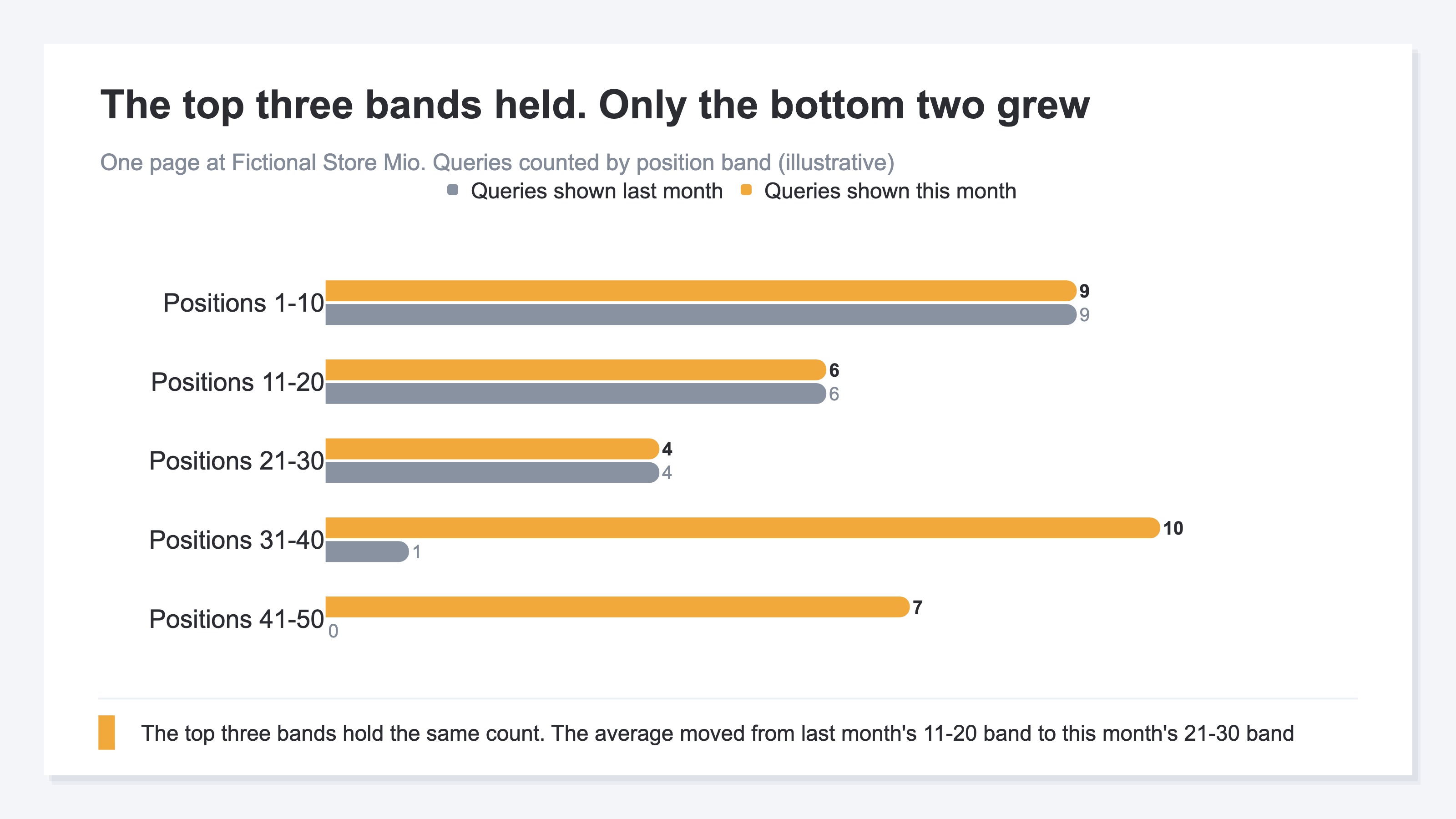
Even when not one existing query has moved in rank, average position worsens once new queries increase further down.
Check it with the figures from Fictional Store Mio. Last month, two queries drew impressions. One had 1,000 impressions at position 5, the other 1,000 impressions at position 7. The average is (5 × 1,000 + 7 × 1,000) ÷ 2,000, which comes to 6.0.
This month, those two held both their ranks and their impressions. On top of them a batch of new queries appeared, drawing 2,000 impressions in total at an average position of 30. The overall average is (5 × 1,000 + 7 × 1,000 + 30 × 2,000) ÷ 4,000, which comes to 18.0.
The original two haven't given up a single rank. Even so, the average worsened from 6.0 to 18.0. What changed is not where the points sit but how many of them there are.
Averages behaving this way isn't limited to search. An average moves with the very act of members entering and leaving the population. JADE Inc. points out that an average value can rise even when the number of individuals in the population falls[2] (with position, a larger number is the worse side, so a rising value means it got worse). The same thing happens on the side where members are added.
Whether the average worsened because points moved or because points were added separates once you lay impressions from the same period over it.
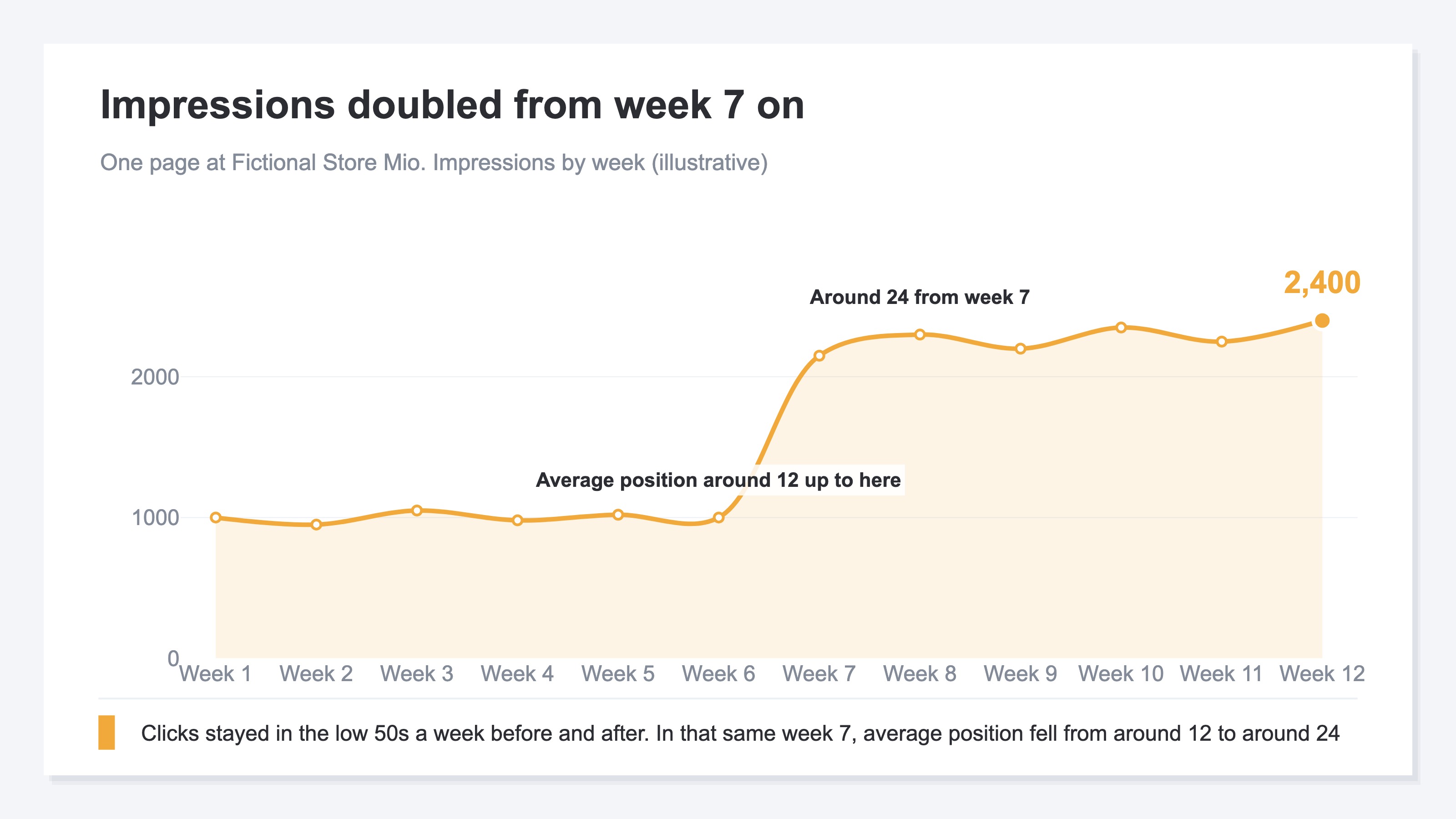
If impressions jumped in the week the position line swung down, what increased is the number of queries. If impressions stay flat and only position falls, existing queries really are falling. Check the clicks line alongside it. If exposure merely widened, clicks continue flat to slightly up, because queries shown far down are barely clicked at all. If impressions fell along with everything else, this isn't the shape this article covers. How to find the side that is falling is covered in how to find content that lost search rankings.
This comparison carries one assumption. The most recent few days haven't finished being aggregated, so including them makes both impressions and clicks read low. Decide where to cut in advance, in why to leave the most recent days out of the comparison.
To look at the added queries themselves, use the query list in Google Search Console. Open it for this month and for last month, and look for rows that appear only in this month. But the list only outputs the queries that drew impressions in that period. To pull out only what wasn't there last month, you end up matching the two lists yourself and building the difference. And even once you have built it, how much each of those rows sold isn't on the same screen. Whether the added exposure is exposure worth having stays undecided to the end.
3. Should You Leave the Added Exposure Alone?#
Added exposure is not something to fix. It is something to look for upside in.
Place the pages whose average worsened on two axes and the handling separates. The horizontal axis is the change in average position, the vertical axis the change in clicks.
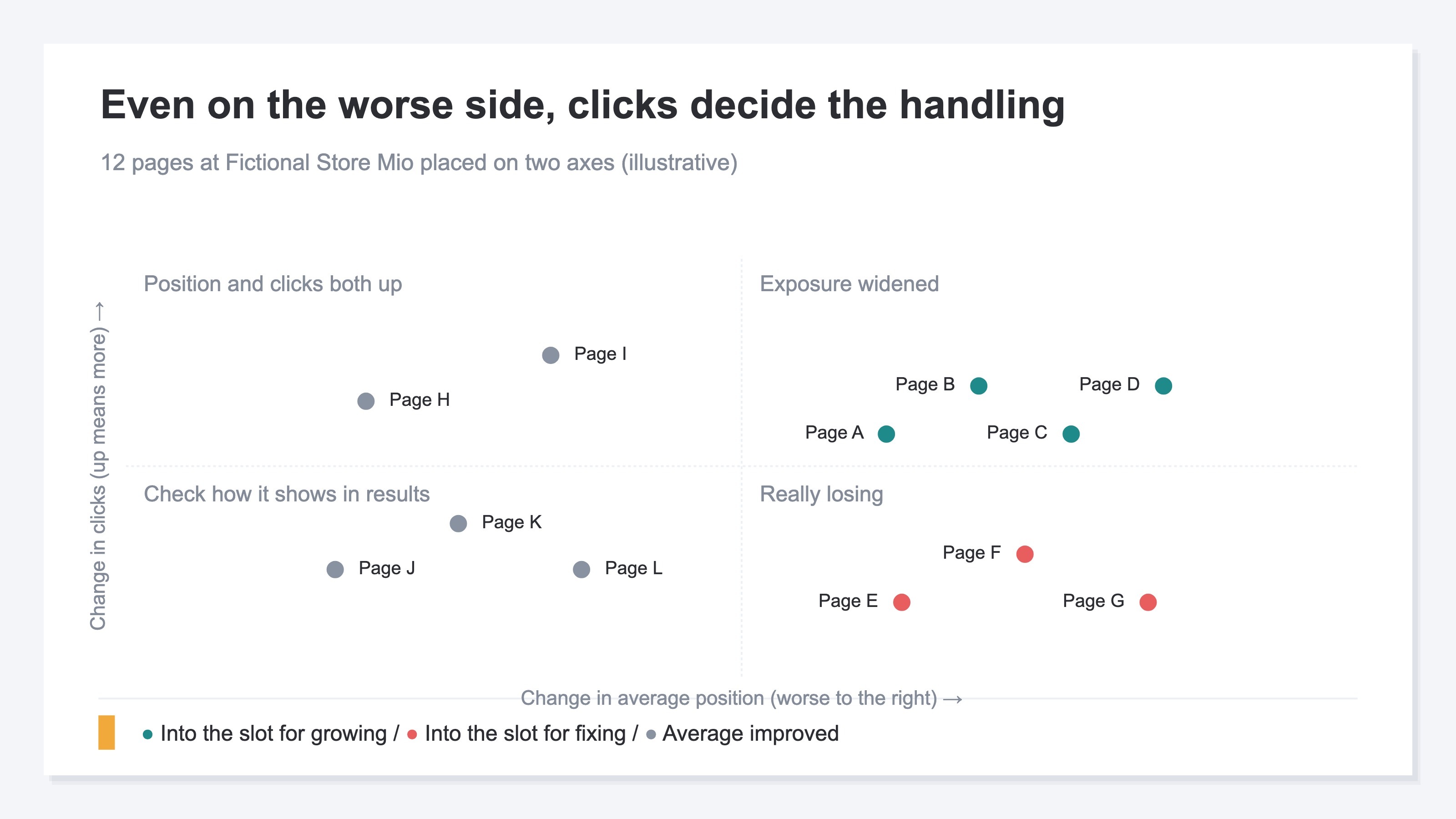
The top right holds pages where average position worsened and clicks increased. The ground they cover has widened, so they are not pages to fix. The bottom right holds pages where average position worsened and clicks fell too. These ones really are losing. How to find the pages that are falling is covered in how to find content that lost search rankings. The left side is where the average improved, and if clicks fell there, the way the page shows in the search results may have changed.
For a page in the top right, the next thing to check is which position band the added queries sit in. If they cluster just below the first page, exposure has piled up in places that are close to rising. Which ones to pick out of that band is covered in striking-distance keywords.
The reason this sorting can't be pushed back is that next month's content plan is waiting on the result. Does the page that worsened go into the slot for fixing, or the slot for growing? Until that is settled, the order you touch things next month can't be assembled at all. And deciding that order takes more than the change in average position. The revenue that landed on the page has to sit in the same row.
RevenueScope solution
A position worsening on its own is not enough to classify a page as stalling. The main signal RevenueScope uses to judge stalling is a real fall in Google search clicks. Position is used mainly on the other side, for finding queries that hold upside. A page whose average worsened because new queries increased, while clicks went up, does not land on the list of pages to fix.
Position is received with the same definition Google Search Console uses, so the weight of impressions rides on it in the same way. That is why the main signal for the judgment is taken off position and placed on the real fall in clicks and on landing revenue.
For each content page, impressions, clicks, average position and landing revenue are displayed together with the classification. Landing revenue is the amount assigned to the page that served as the entry point for visits that went through to a purchase. Visits judged to be bots are not included in this figure.
Ask an AI assistant such as ChatGPT over MCP, "How did the position and the landing revenue of our content pages change compared with last month?", and it comes back in this form.
Fictional Store Mio's content pages, asked of RevenueScope (illustrative)
| Page | Impressions | Clicks | Average position | Landing revenue | Classification |
|---|---|---|---|---|---|
| Shampoo for wavy hair | 4,000 → 9,000 | 200 → 240 | 12 → 24 | ¥380,000 | Upside |
| How to use hair oil | 6,000 → 6,200 | 300 → 180 | 9 → 11 | ¥60,000 | Stalling |
| How to choose a treatment | 3,000 → 3,100 | 150 → 150 | 15 → 15 | ¥90,000 | Stable |
| Refill pack sizes | 5,000 → 5,200 | 90 → 95 | 18 → 17 | ¥40,000 | Low clicks |
Note: the table above is one example (illustrative) built for explanation from Fictional Store Mio, with the figures rounded. The sample store that opens from the CTA reads sample data, refreshed daily, so even on the same cut neither the page names nor the amounts will match.
Of the four rows, the one whose average position worsened most is shampoo for wavy hair. Yet in landing revenue, that row stands first of the four. Impressions more than doubled and clicks did not fall. That is why its classification reads as upside.
The row classified as stalling is how to use hair oil, where the drop is only two positions. Even so, clicks are down by two fifths. Read the list in order of how far the position fell and this row stays buried near the bottom.
The page that goes into this month's work slot is how to use hair oil, and shampoo for wavy hair goes into the slot for growing. The handling swaps around compared with looking at average position alone.
FAQ#
Frequently asked questions#
Q. My rank tracker shows no drop, but the average position in Google Search Console alone has fallen. Should I trust the tracker or Search Console?
A. Both values are right; they simply measure under different conditions. A rank tracker measures the keywords you chose under the conditions you set, while average position bundles together every query that drew an impression[1]. What that difference consists of is covered in how to read it when rank tracker numbers disagree.
Q. Where can I check whether new queries increased?
A. It comes down to opening the query list in Google Search Console for this month and for last month and comparing them. But the list comes out per period, so pulling out only the rows that weren't there last month means building the difference yourself. On top of that, how much each of those rows sold isn't on the same screen.
Q. Should a page whose average position fell be rewritten?
A. Checking the clicks first is soon enough. If clicks are increasing, the rewrite risks trimming away the ground that just widened. What to put your hands on is the pages where clicks have actually fallen.
Q. Can I estimate the clicks I lost from how far the average position worsened?
A. You can't. The average moves with the very composition of the queries that drew impressions[1]. How far it worsened and how clicks moved change separately, so check what you lost in the actual number of clicks.
Summary#
Even when average position falls sharply, it doesn't follow that your existing queries lost rank. The average is built from the topmost rank taken at every single impression[1]. If new queries increase further down, that alone makes the average worse. The original ranks stay exactly where they were.
The clue that tells them apart is impressions over the same period. If impressions jumped in the week the position line swung down, what widened is the ground you cover. If clicks continue flat to slightly up, you haven't lost anything. It is when impressions stay flat and only position falls that the decline is real. If impressions fell along with everything else, this isn't the shape this article covers.
The order you put things in next month's plan isn't settled by how far the average position fell. The rows where clicks actually fell, and the rows where landing revenue remains. Check those two on the same screen first, then split the pages into the slot for fixing and the slot for growing.
See which ads actually drive revenue, at a glance
Free up to 2,000 sessions/month, AI connection included. No credit card required. Up and running in 5 minutes.