
"We built a revenue dashboard, but staring at it doesn't tell us what to do next." This is one of the most common patterns I hear from EC operators. The more charts, metrics, and filters you stack onto a dashboard, the more impressive it looks — and the slower decisions get. A dashboard isn't a metric showcase; it's a 60-second decision tool.
This article walks through how to design a revenue dashboard that actually drives action. The recommended layout, the order of the 5 KPI cards, channel-level Revenue Per Session (RPS), business-model templates, the 4 most common pitfalls, and how GA4, BI tools (Looker Studio / Tableau / Power BI), and dedicated analytics tools compare for this job. Throughout this article, we use Revenue Per Session (RPS) = Revenue ÷ Sessions as a core metric — note that RPS is not yet a widely recognized industry standard and is rarely a default metric in mainstream tools, despite being mathematically equivalent to CVR × AOV.
Key takeaways#
- A working revenue dashboard has only 5 KPIs and a channel-level RPS table. Revenue / CVR / AOV / RPS / ROAS at the top, channel-level RPS below. Anything beyond that slows the read.
- Dashboard design is mostly about cutting, not adding. BI tools let you put anything on screen, which is why most dashboards balloon to 20+ metrics. The real question is "if this metric moves, does next week's plan change?" — only metrics that pass that filter belong on the screen.
- GA4 + BI tools alone struggle with revenue-first dashboards. GA4 defaults to behavior metrics (sessions, PV, bounce rate); revenue metrics need extra setup. BI tools are blank canvases that demand non-trivial design effort. A dedicated tool that defaults to revenue-first is often the more realistic option for SMBs.
1. What a revenue dashboard is — 5 KPIs in one frame#
A revenue dashboard exists to make a decision in one minute, not to display data. If the goal is just observation, a report is enough. A dashboard turns numbers into the next action.
The base layout that works for most EC operators puts 5 KPIs and a channel-level RPS table on a single screen.
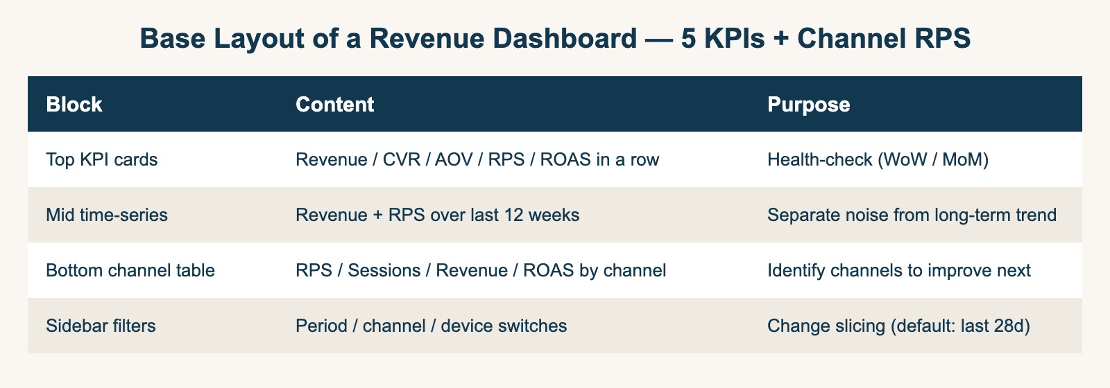
| Block | Content | Purpose |
|---|---|---|
| Top KPI cards | Revenue / CVR / AOV / RPS / ROAS in a row | Health-check (WoW / MoM) |
| Mid time-series | Revenue + RPS over the last 12 weeks | Separate noise from long-term trend |
| Bottom channel table | RPS / Sessions / Revenue / ROAS by channel | Identify where to push next |
| Sidebar filters | Period / channel / device | Default: last 28 days, all channels |
In one minute of looking at this screen, the question "which channel needs work this week?" should be answerable. If a metric you want to add doesn't pass the test "if this moves, does next week's plan change?", leave it off the screen.
For the definitions and relationships of the 5 KPIs themselves, see Marketing KPI design: 5 metrics that drive decisions. This article focuses on how to lay them out on screen.
1.1 The dashboard is for one role at a time#
The first design decision is who this dashboard is for, how long they have, and what decision they're making. In most EC orgs there are at least three different audiences:
- Marketing lead: a 30-minute weekly review, picking the channel to focus on next
- EC operator: a 5-minute daily check for anomalies and yesterday's revenue
- Executive: a once-a-month look at overall business health
These three want different timescales and different granularities. One dashboard trying to serve all three rarely serves any of them. If you're building only one screen, build the marketing-lead version — it's the largest common denominator.
1.2 Reporting and decision-making are different functions#
A common failure mode is building a report and calling it a dashboard. They're different:
- Report (showing numbers): answers "what was last month's CVR?" — assembly and display
- Dashboard (driving decisions): answers "which channel should we lean into next week?" — comparison and anomaly detection
A dashboard always shows a comparison reference (week-over-week, month-over-month, against other channels) on the same screen. A screen that only shows absolute values, in big fonts, is a report — not a dashboard.
3 examples of Revenue First decision-making#
While CVR and session counts dominate dashboards in many EC operations, they hide the key question: which ad actually drove revenue? Here are three real-world decision shifts that Revenue First enables.
Example 1: From CVR-priority to RPS-priority budget allocation#
Suppose two ad channels:
- Channel A: 1,000 sessions, CVR 3%, AOV $50 → Revenue $1,500, RPS $1.50
- Channel B: 500 sessions, CVR 2%, AOV $200 → Revenue $2,000, RPS $4.00
CVR-only judgment recommends Channel A. RPS judgment recommends Channel B. Revenue First flips the budget allocation by exposing the AOV multiplier.
Example 2: 5-metric monthly review compresses 3 hours into 30 minutes#
A typical EC weekly review tracks 20+ KPIs across GA4, ad managers, and BI dashboards. Revenue First trims this to 5 metrics: Revenue / RPS / AOV / CVR / ROAS. Decision velocity compounds — what was a 3-hour Friday meeting becomes a 30-minute focus block.
Example 3: ROAS 300% can still be a loss#
A campaign with ROAS 300% looks profitable until gross margin enters the picture. At 30% gross margin, breakeven ROAS is 333%. The 300% campaign is bleeding cash. Revenue First insists on margin-aware ROAS interpretation, not raw ROAS celebration.
2. The 5 elements that belong on the screen#
Every element on a revenue dashboard should be derivable from Revenue = Sessions × CVR × AOV. If something doesn't trace to this formula, the burden of proof is on whoever wants it on the screen.
2.1 Order of the 5 KPI cards#
The order matters. Reading left-to-right should walk the reader through the revenue decomposition naturally.
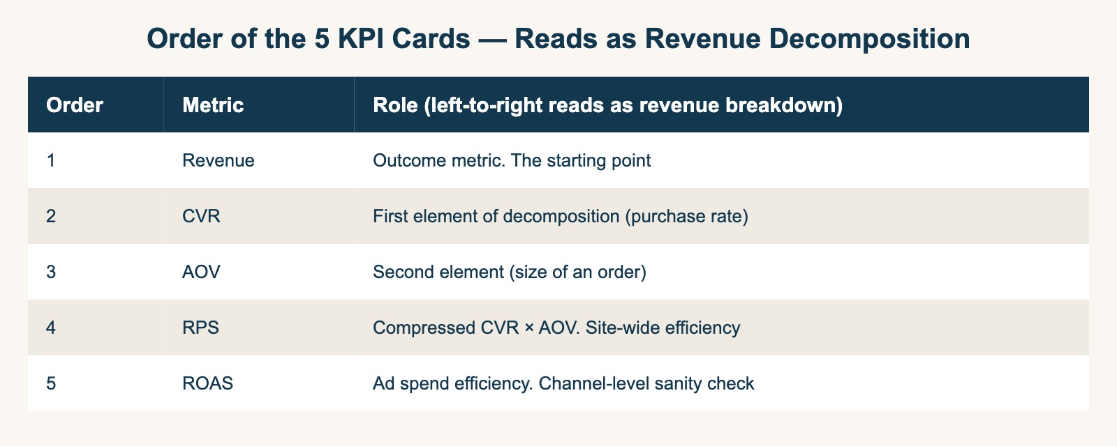
| Order | Metric | Role |
|---|---|---|
| 1 | Revenue | Outcome metric — the starting point |
| 2 | CVR | First decomposition element (purchase rate) |
| 3 | AOV | Second element (size of an order) |
| 4 | RPS | Compressed CVR × AOV — site efficiency |
| 5 | ROAS | Ad spend efficiency — channel-level sanity check |
Read across, and the brain follows: outcome → components → site efficiency → ad efficiency. Reordering changes the meaning of the dashboard, so this is a design decision worth aligning the team on.
2.2 The channel RPS table is the real workhorse#
The 5 KPI cards show overall health. The thing that actually drives next week's decision is the channel-level comparison. The channel RPS table is, in practice, the most important element on the dashboard.
| Channel | Sessions | RPS | CVR | AOV | ROAS (paid only) |
|---|---|---|---|---|---|
| Organic Search | 12,400 | $1.85 | 1.8% | $103 | — |
| Paid Search | 5,200 | $2.40 | 2.5% | $96 | 320% |
| Paid Social | 8,800 | $1.10 | 1.2% | $92 | 180% |
| 3,100 | $4.20 | 4.1% | $102 | — | |
| Direct | 4,500 | $3.20 | 3.0% | $107 | — |
Reading this table should produce a candidate action in roughly 30 seconds: "Email RPS is 3x the others but only 3,100 sessions — CRM expansion is next week's priority." A 20-column table doesn't allow that kind of read.
2.3 The time-series shows two lines, not five#
Plotting all 5 KPIs over time creates noise. In practice, Revenue + RPS is the right pair:
- Revenue — outcome metric, the overall trend
- RPS — leading indicator that often moves before revenue does
CVR / AOV / ROAS are easier to read in the channel table than in a time-series. Reserve the time-series for "what happened in the last 4 weeks?" and "is the seasonal peak going to land again?".
2.4 Health alerts at the top#
A small "alerts" strip at the very top of the dashboard collapses health checks into a glance:
- Bounce rate > 60% → warning
- Direct/(none) > 30% of total → warning
- Channel sessions down >30% week-over-week → warning
Health metrics are discussed only when they breach a threshold. This pattern lets weekly meetings stay focused on the 5 core KPIs.
For why GA4's Direct/(none) bucket inflates, see The 5 reasons GA4 Direct/(none) traffic spikes.
Decision flow: weekly channel RPS review#
The Revenue First weekly review compresses budget reallocation into 4 steps:
Step 1: Pull weekly Revenue + Sessions per channel
        ↓
Step 2: Calculate RPS = Revenue ÷ Sessions per channel
        ↓
Step 3: Rank channels by RPS
        ↓
Step 4: Apply the 20/20 rule:
        - Top RPS channel: increase budget by +20%
        - Bottom RPS channel: decrease budget by -20% (or pause)
        - Middle channels: hold, evaluate by CVR / AOV separately
        ↓
Step 5: Re-measure next week
Why weekly, not monthly?
Monthly cycles average out winning and losing days. Weekly cycles expose channel decay (e.g., Meta ad fatigue) and capitalize on early signal. Revenue First operators we observed shift to weekly RPS reviews within 30 days of adopting the dashboard.
Edge case: low-volume channels
Channels with fewer than 100 sessions/week have noisy RPS. Combine them into a "long-tail" bucket until session volume stabilizes.
Breakeven ROAS by gross margin#
ROAS 100% does not mean breakeven. ROAS only equates to ad-spend recovery when gross margin is 100% — which never happens in real EC.
The true breakeven ROAS depends on gross margin:
| Gross margin | Breakeven ROAS | Example: $1,000 ad spend → required revenue |
|---|---|---|
| 10% | 1,000% | $10,000 |
| 20% | 500% | $5,000 |
| 30% | 333% | $3,330 |
| 40% | 250% | $2,500 |
| 50% | 200% | $2,000 |
| 60% | 167% | $1,670 |
Formula: Breakeven ROAS = 1 ÷ Gross Margin × 100%
Most Japanese SMB EC operates at 30–50% gross margin (apparel, cosmetics, food D2C). Their breakeven ROAS sits between 200% and 333%, not 100%. ROAS 200% with a 20% gross margin is still a loss. For ROAS formulas and benchmarks, see The complete guide to ROAS.
3. Four common pitfalls in dashboard design#
The hard part of a dashboard isn't building it — it's deleting things. The four most common failure modes:
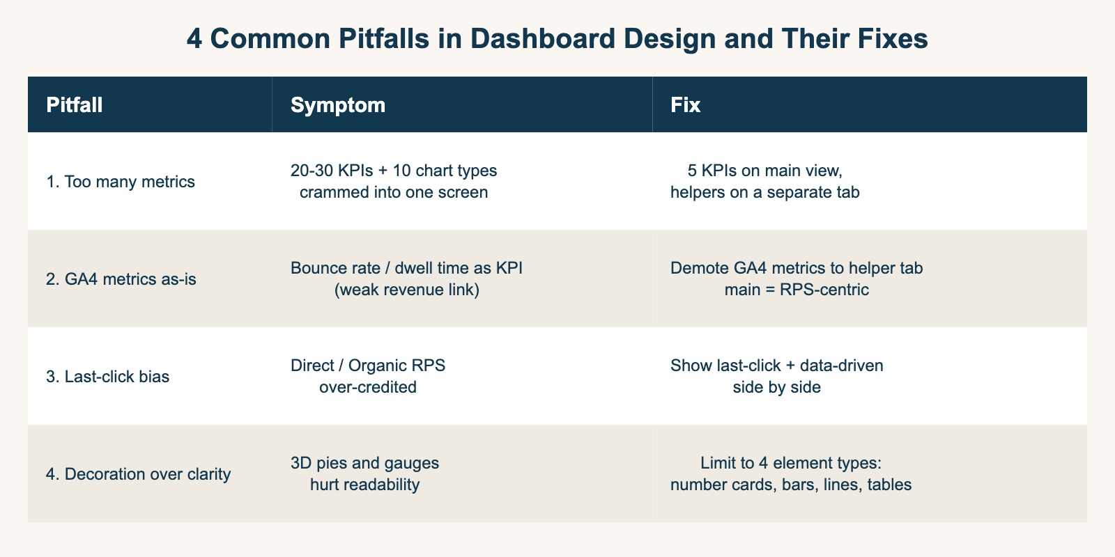
3.1 Too many metrics — the 1-minute read breaks#
The most common failure. "We should be data-driven" turns into 20-30 metrics + 10 chart types crammed into one screen. The moment scrolling is required to see everything, the dashboard has lost its purpose.
Fix: Keep 5 KPIs + the channel RPS table on the main view. Move everything else to a separate "supporting metrics" tab. The default screen on open should be the main view only.
3.2 GA4 metrics dropped in as-is#
It's easy to copy GA4's default report layout into a dashboard. The trouble is that GA4 is optimized for behavior (sessions, PV, bounce rate, dwell time), not for revenue efficiency (RPS by channel). Bounce rate moving 0.1 doesn't change next week's plan.
Fix: Demote GA4-native metrics to the supporting tab. The main view stays revenue-first. RPS, which GA4 doesn't expose by default, comes from your session log or from a dedicated tool.
For GA4's structural limits, see The GA4 utilization wall.
3.3 Last-click bias in channel breakdown#
A channel RPS table built on last-click attribution alone distorts the picture. Direct and Organic Search look artificially strong, while authentic awareness contributions from Paid Social disappear.
In a real customer journey — Meta ad → returning via search → CV — last-click hands 100% of the revenue to search. A dashboard that shows only this view leads to "double down on search" decisions that erode the broader funnel.
Fix: Show both last-click and data-driven (or linear) attribution side by side. Channels with large gaps between the two are channels with significant awareness contribution — handle them with caution.
For attribution basics, see GA4 attribution blind spots and The last-click trap.
3.4 "Beautiful" over "readable"#
The flexibility of BI tools (Tableau / Power BI / Looker Studio) often backfires. 3D pies, ornate gauges, color-saturated heatmaps — they look impressive but degrade readability. A dashboard for decisions optimizes for fast comparison, not for visual sophistication.
Fix: Limit visual elements to four types — number cards, bar charts, line charts, tables. Use color in three states only — warning (red), healthy (green), neutral (gray). Document the visual rules so they survive personnel changes.
4. Templates by business model#
The 5-KPI framework is universal; the layout shifts by business model.
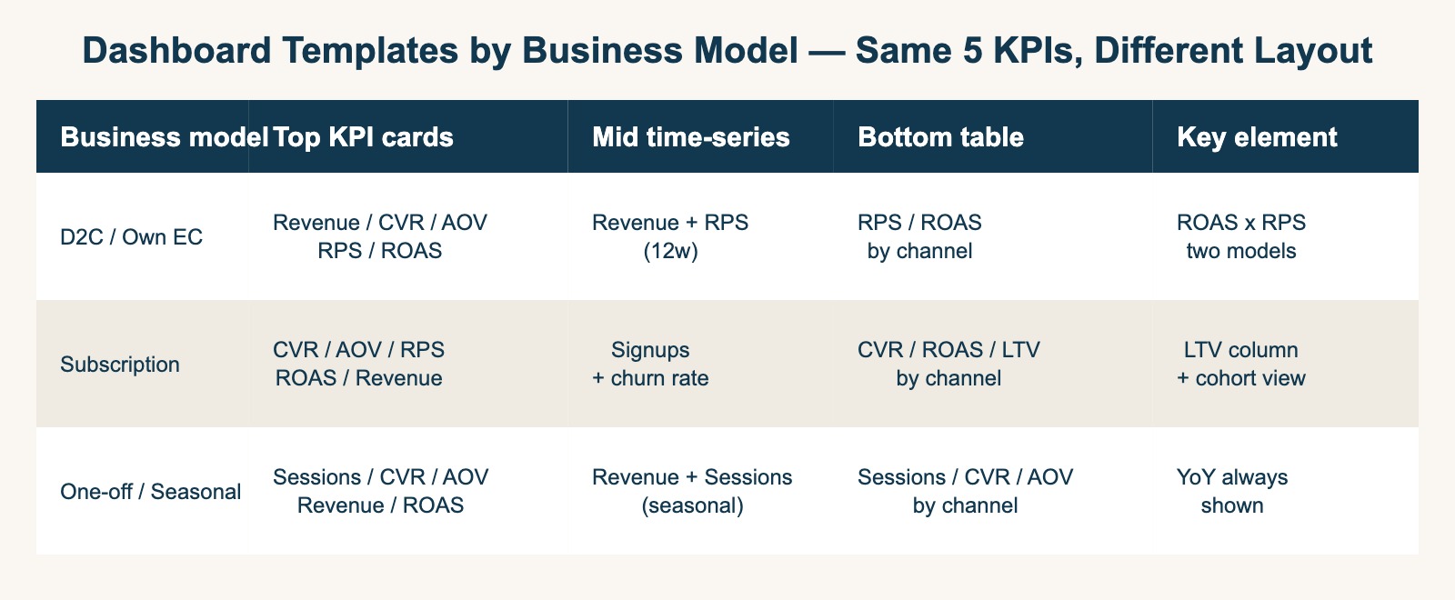
4.1 D2C / own EC (Shopify / BASE / STORES)#
For D2C brands, the channel-level RPS table is the centerpiece. Most traffic is paid, so ROAS and RPS need to sit side by side.
| Block | Element | Weighting |
|---|---|---|
| Top KPI cards | Revenue / CVR / AOV / RPS / ROAS | All 5 equally |
| Time-series | Revenue + RPS, 12-week window | Weekly aggregation |
| Bottom table (key) | RPS / ROAS by channel | Last-click + data-driven side by side |
| Sidebar | Campaign-level filter | Drill down to ad-set granularity |
The pattern D2C dashboards must surface: a high-ROAS campaign whose RPS is below organic search RPS is actually dragging down site-wide revenue efficiency. The channel table makes this visible.
4.2 Subscription#
For subscription, post-acquisition retention dominates revenue. The 5-KPI base extends with LTV and churn as supporting metrics on a monthly panel.
| Block | Element | Weighting |
|---|---|---|
| Top KPI cards | CVR / AOV / RPS / ROAS / Revenue | CVR (signup rate) first |
| Time-series | New signups + churn rate | Cohort overlay |
| Bottom table | CVR / ROAS / LTV by channel | LTV column added |
| Monthly panel | Cohort-based LTV / churn | 3-, 6-, 12-month cohorts |
The decision-driver: a channel with high ROAS but high churn and low LTV. RPS and LTV side by side reveals it.
4.3 One-off / Seasonal (food, gifts, seasonal)#
For one-off purchases, new-customer acquisition is the engine. AOV and Sessions get more weight than RPS.
| Block | Element | Weighting |
|---|---|---|
| Top KPI cards | Sessions / CVR / AOV / Revenue / ROAS | Sessions first |
| Time-series | Revenue + Sessions | Seasonal peaks emphasized |
| Bottom table | Sessions / CVR / AOV by channel | RPS de-emphasized |
| Sidebar | Campaign-period filter | Mother's Day / Holiday / Christmas etc. |
For seasonal businesses, year-over-year comparisons must be on the dashboard. Week-over-week alone misreads seasonal effects.
5. Tool comparison — GA4 / BI / dedicated analytics#
The realistic choices for building a revenue dashboard fall into three categories.
| Category | Representative tools | Monthly cost | Strengths | Limits |
|---|---|---|---|---|
| GA4 + Looker Studio | Google Analytics 4 + Looker Studio | Free | Easy entry, GA4-native | Revenue metrics need extra setup; RPS is manual |
| General BI tools | Tableau / Power BI / Looker Studio Pro | $50-300+/user | Maximum flexibility, scales | High design effort, ops-heavy |
| Dedicated analytics | RevenueScope / similar EC-focused tools | $30-300/month | Revenue-first defaults, minimal setup | Less flexible, business-model fit matters |
5.1 GA4 + Looker Studio strengths and limits#
The default free combo. To turn it into a revenue dashboard, three additional steps are needed:
- Channel taxonomy fixes — GA4's default channel grouping is not optimized for EC (Direct/(none) tends to balloon)
- RPS calculations — GA4 has no native RPS metric; Looker Studio formulas reconstruct it manually
- Attribution selection — last-click vs data-driven needs to be a conscious user choice
With an experienced analyst, 1-2 weeks. Without one, this is a multi-month effort with a fair amount of trial and error.
5.2 General BI strengths and limits#
Tableau and Power BI have unmatched expressive power. The trade-off is structural ops cost and personalization:
- When the BI lead changes, knowledge-transfer costs are high
- "Just add one metric" turns into a one-week engineering ticket
- Per-user licensing scales linearly with team size
For mid-to-large EC orgs with full-time BI staff, this is the best option. For SMB ($1M-$10M annual revenue), the operational weight is usually too much.
5.3 Dedicated analytics strengths and limits#
EC-focused tools (like RevenueScope) ship with revenue-first defaults. After install, the 5 KPIs and channel-level RPS appear without bespoke setup.
- Strengths: minimum setup, minimum ops cost, sustainable for SMB teams
- Limits: less expressive than full BI; vertical-specific fits matter
For teams that want to spend their time on product and ad operations rather than dashboard engineering, this is the realistic choice.
For a related comparison study, see Heatmap tools comparison: 5 free / paid options.
6. Where RevenueScope fits#
The 5-KPI + channel-RPS layout is derivable from Sessions × CVR × AOV = Revenue. The structural problem is that few tools ship this layout as a default.
GA4 is excellent at traffic measurement, but defaults to behavior metrics. BI tools maximize flexibility at the cost of high design effort. Neither is wrong — they're just not optimized for the revenue-first dashboard most EC operators actually need.
We're building RevenueScope precisely for this: a thin analytics layer that sits alongside GA4, reads from your existing dataLayer, and surfaces the 5 KPIs + channel-level RPS in a single screen. If you already have GA4 ecommerce events configured, additional setup is minimal.
For the teams that have built dashboards with 20 metrics and watched no one use them, the migration path is the same: cut to 5, add the channel RPS table, run for a quarter, and decide whether the framework is doing its job.
UTM hygiene is a prerequisite — broken UTMs corrupt RPS and ROAS by channel. See UTM parameters: the right way for the foundation. For AOV improvement, see AOV (average order value): the right way to calculate and grow it. For ROAS calculation and benchmarks, see The complete guide to ROAS.
References#
[1] Google Analytics. "\[GA4\] Default channel group" 2024
[2] Google Analytics. "\[GA4\] Conversions" 2024
[3] Google. "Looker Studio overview" 2024
[4] Tableau. "What is a dashboard? A complete overview" 2024
[5] Microsoft. "Power BI documentation - Dashboards" 2024
[6] Shopify Plus. "BFCM 2024 Recap" December 2024
[7] Harvard Business Review. "Identify the Marketing Metrics That Actually Matter" July 2015
See which ads actually drive revenue, at a glance
Free up to 5,000 sessions/month, AI analyst included. No credit card required. Up and running in 5 minutes.
Start measuring for free